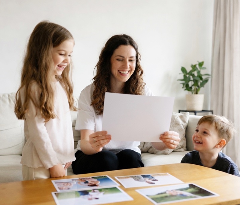
There are thousands of photos on your phone right now. Proud parents and grandparents to a new born, first days at school, the dog when he was still a puppy, that one holiday where the light was perfect, and roughly fifty nearly-identical shots of the same birthday cake.
They deserve better than a screen.
The trouble is that ordering printed photos can throw more questions at you than you expected and you don’t want to make a mistake. What size? Gloss or matt? Why has the top of someone's head vanished in the preview? Is a canvas better than a metal print? And what on earth is a Giclée?
This guide answers all of it in plain English. Read it start to finish, or jump to the bit you need. By the end you'll hopefully know exactly what to order for every photo you love.
Honestly, it takes about two minutes. Open the PostSnap site or app, pick the print type and size you want, tap through to your camera roll and choose your photos. Check how each one is cropped, look at the preview, order. They arrive at your door, printed properly, a few days later.
That's the whole process. But a couple of small choices before you upload can make a real difference to how the prints turn out.
Where you can, choose the original photo you took with your phone camera and that probably lives in camera rather than a version that's been passed around from you social media or messaging accounts.
Photos from WhatsApp, Facebook or Instagram have usually been reduced down to a smaller file so they send quickly. You often can't see the difference on a phone screen but you can see it when it’s printed as a 10×8 on the mantelpiece.
Screenshots are the bigger problem. As well as being lower quality, a screenshot of an Instagram post captures your whole screen, so you end up with solid black bands, the app's buttons and someone's username as part of the photo you upload to the website or app and unless cropped out this is what we will print.
If a screenshot is genuinely all you have (and sometimes it is, especially for older photos friends have sent you), it will still make a decent small print. Just remember to use our easy to use cropping tool to crop out the bits you don’t want printed before you order, and keep the size sensible.
If your iPhone is set to optimise storage, it keeps a lightweight version on the phone and the full-size one in iCloud. Tap the photo and let it load fully before you upload. On a slow connection you'll see a little progress circle. Wait for it.
Almost always, yes. Any iPhone from the last several years produces files with plenty of detail for standard prints, and usually for large wall art too.
But the phone model matters less than people think. What really decides how well a photo enlarges is:
A bright, sharp photo from an older iPhone will beat a dark, wobbly one from the newest model every single time, even though the newer file has more pixels in it.
One last thing worth saying: sending a photo to a printing lab isn't the same as printing it on the printer in the spare room. We print onto real photographic paper, in sizes an office printer can't touch, with colour handled by people who do this all day.
Print photos from your iPhoneSame idea, and just as quick. Open the website or app, choose your size, pick photos from your gallery, optimise, check the crop and order.
The only extra thing to know about Android is that your photos might be in more than one place:
If you're not sure which holds the original photo, the Camera or DCIM folder is usually the safest bet.
Google Photos can back up either at original quality or in a compressed, space-saving version, depending on the setting you chose (often years ago, without really reading it). If you've been using the compressed option, your backup is a slightly reduced copy of the original.
It's still perfectly printable at everyday sizes. Just be a little more careful before ordering something big. And if the original is still on the phone, use that.
The same applies to anything saved from WhatsApp or Messenger. Those files are shrunk in transit, and it tends to show up as softness or pixelated when the photo is enlarged and printed.
Yes, and often beautifully. Modern Android cameras are excellent. But megapixels alone don't promise a good enlargement, so:
And if a photo doesn't have quite enough detail for the size you've picked, we'll flag it rather than quietly print something disappointing.
Print photos from your phoneThere isn't one "best" paper, which is a slightly annoying answer, so here's a more useful one: it depends on what the photo is and where it's going to live.
This is what most people picture when they think of a proper printed photo. Smooth, rich, with natural skin tones and gentle transitions between colours. It's what you want for the photos that matter.
Our photo prints are printed on genuine Fujifilm Crystal Archive and Supreme photographic paper, using a silver halide process. The important part is how the image gets onto the paper. Rather than ink being laid on top of the surface, your image is exposed into light-sensitive layers within the paper itself and then developed. That's why a real photographic print has that unmistakable depth, and why skin tones look like skin rather than like printing.
Our supplier Fujifilm designs these papers for high image quality, faithful colour, clean whites and long-term stability, which is exactly why we use them.
If you're printing artwork, an exhibition-style photograph, or something where you want the paper itself to be part of the look, fine art paper is the one. These are heavier, often cotton-based papers, either smooth or textured, printed with pigment inks.
Hahnemühle, one of the best-known fine art paper makers, describes papers like its Photo Rag as cotton artist papers made for high-quality inkjet printing, where the surface texture adds depth and character to the image. That's the point of them: the paper is doing some of the work.
We don’t use this type of standard 4 colour inkjet paper ourselves but it’s cheaper to print than our silver halide photo paper and generally used for casual prints where absolute quality isn't the priority (party photos, a batch for the kids' scrapbooks, temporary displays).
No, and this one catches a lot of people out.
Thickness is about feel, not quality. A genuine photographic print is designed to have a bit of flex in it, because it needs to sit in albums, slide into frames and be handled. That flexibility isn't a shortcut, it's the format working as intended.
Meanwhile, a thick card can feel expensive and still reproduce colour, skin tones and fine detail less faithfully than a thinner photographic print.
What actually determines quality is the whole combination: the paper, the printing technology, how carefully the colour is managed and how well the lab finishes the job. Not grams per square metre.
Both look great. They just look great in different ways, and one of them behaves better behind glass.
Gloss has a smooth, shiny surface. It tends to make colours pop, deepens contrast and gives you that classic, punchy photo-shop-on-the-high-street look.
A Gloss finish suits:
The downsides with gloss prints: gloss reflects. Under a ceiling spotlight or next to a window you'll see glare. It also shows fingerprints the moment anyone picks it up. Gloss prints also have a tendency to stick to the glass of a frame over time and especially if it’s in a room which is warm or humid.
Here's something worth knowing, because it confuses almost everyone.
In UK photo printing, "matt" almost always means “lustre”. A completely flat matt finish is rare on photographic paper. When we (and most UK photo labs) say matt, we mean a lustre surface which has a very fine texture with a subtle sheen which sits somewhere between shiny and flat.
Lustre gives you rich colour with far less glare, and it hides fingerprints much better. It's the finish most photographers reach for.
A matt (lustre) finish especially good for:
That last point matters more than people realise. Whereas gloss prints can stick to the inside of frame glass over time lustre doesn't have the same tendency, which is why our technicians usually suggest it for anything you're framing.
Both do. It's genuinely a matter of taste, not quality.
No. The detail in the image is identical. A lustre surface scatters light slightly differently, so at certain angles it can look a touch softer or a shade darker in some lights than the same photo on gloss. But nothing has been lost from the picture itself.
Plenty of photographers prefer lustre precisely because it gives you detail and colour without the glare and the smudges.
It depends on three things: the photo, where it's going, and how close people will stand to it.
There's no single right answer. A 6×4” print is perfect in an album but pointless above the fireplace. A 20×16” print is glorious on a wall and absurd on a bedside table.
It’s worth mentioning here that when you see the symbol “ it means inches. Also, 6x4” is generally used for both a landscape and portrait print and it is the photo orientation which determines the orientation of the print. Although we suggest printing a portrait photo as a portrait print our website and apps do let you rotate the photo to the other way round but it is important to check the result and crop if necessary because important parts of the photo may be automatically cropped out when rotated and not visible when printed.
6×4 inches: The classic. It’s for albums, photo boxes, big batches after a holiday. Cheap enough to print dozens at a time.
7×5 inches: A step up in presence. Lovely in a small tabletop frame, and a good size for giving away.
8×6 inches: A useful middle ground with real impact, and it almost matches the shape most phone photos come out of the camera, so you'll lose very little around the edge in the crop.
10×8 inches: The traditional portrait size. This is for the framed wedding photo on the sideboard, the school portrait, the one of the grandparents or the graduation photo. Slightly different proportions to most phone photos, so expect a small crop which means you should try to avoid any important part of the image near the edge of the photo.
A5 (14.8×21 cm): Neat, frame-friendly and easy to display on a desk or shelf.
A4 (21×29.7 cm): A practical wall or shelf size, and A-sized frames are everywhere, from the high street to the supermarket.
A3 (29.7×42 cm): Proper wall art, but still easy and affordable to frame.
12×12 inches: Our most popular square size, and ideal if you optimise your photography for Instagram. Squares look brilliant in multiples, so three or more together make a very tidy gallery wall. Keep in mind that if you use a frame and mount the overall size of the photo and frame on the wall can be around 14x14 inches.
16×12 inches and up: We’re in statement territory with these enlargements. They’re worth it for your best photos, provided the original file has the detail to support it.
Before you order anything large, cut a piece of paper or newspaper to the exact size and stick it on the wall with a bit of masking tape. Live with it for a day.
Dimensions on a phone screen mean almost nothing. Everyone underestimates wall space, and the single most common regret we hear is "I wish I'd gone bigger".
If you already own the frame: order to match the frame's stated image size or, if it has a mount, the mount aperture (the opening the photo shows through). The stated image size is usually a few millimetres larger than the inside of the frame itself or the opening of the mount if used - it’s not the outside dimensions of the frame.
If the photo comes first: choose the print size that suits the photo's shape and composition, then find a frame to fit. This saves you cropping something you love just to squeeze it into a frame with different proportions.
View all photo print sizesA great black and white print doesn’t always need a black and white photo because websites and apps now let you turn your colour photos into black and white prints by applying a black and white effect.
However, it’s still important to select a colour photo which will generate an acceptable black and white finish once colour is gone based upon:
Photos with directional light (from a window, say), a simple background, interesting texture or a really good expression tend to look good in mono. Colour photos which contain lots of dark colours like dark greens and reds and little contrast may produce a dark printed photo.
Sometimes colour just gets in the way. A cluttered kitchen, clashing outfits, a strange orange cast from the lighting: strip the colour out and suddenly you're just looking at your children's faces or a timeless wedding photo.
It also makes photos from different years, cameras and lighting conditions look like they belong together, which is why so many gallery walls are entirely black and white.
Black and white prints are particularly effective for:
Your phone screen creates its own light. Paper can only reflect the light already in the room. That's why a photo can look moody and atmospheric on the phone and simply look dark on paper.
Zoom in on faces, eyes, dark clothing and shadowy corners. If you're already squinting to make something out on screen, it will be harder to see in print. Nudge the brightness up a little before uploading, especially for indoor shots.
Adding contrast can make a dark black and white photo brighter and give it real punch but push it too far, though, and you lose information at both ends: the shadows turn into flat, featureless black, and the highlights blow out into blank white paper. Once that detail is gone in the file, no printer can bring it back.
The best mono prints keep a full range: clean bright whites, plenty of greys in between, and deep blacks that still have something in them.
Matt (lustre) is the usual choice. It cuts reflections and gives tonal images a refined, gallery-ish look. Fine art matt paper improves that further still.
Gloss can be superb when you want the blacks to look as deep and glossy as possible, and it suits high-contrast, graphic images. Neither is wrong. It depends on the photo and the room it's going in.
Create black and white photo printsEvery photo has a limit. Enlarging spreads the same pixels over a bigger area, so at some point detail starts to soften. That's just physics.
The good news is that the limit is usually much further away than people assume, and you absolutely do not need every print to be a perfect 300 pixels per inch.
A digital photo on screen is a grid of pixels. Your file might be 4,032 × 3,024 pixels, for example.
PPI (pixels per inch) is how many of those pixels end up in each inch of the finished print. Same file, bigger print, fewer pixels per inch.
DPI (dots per inch) describes how many dots of ink a printer lays down on one inch of paper. People use the two terms interchangeably, and for ordering prints the difference doesn't really matter.
What matters to you is simply: how many pixels does my photo have, and how big am I printing it?
No. It's a good target for small prints you'll hold in your hand and study closely. It is not a pass/fail line.
Big prints are looked at from further away, and viewing distance is doing half the work. As a rough guide, around 300 PPI is ideal for small prints, around 260 PPI is comfortable for most wall prints when viewed from say 2 metres away, and large wall art viewed from across a room can look excellent at even less.
Canvas is more forgiving still, because the woven texture of the surface disguises fine pixel detail. That's why canvas can work well from files that would be marginal on smooth photographic paper.
| Print size | Ideal pixels at 300 PPI |
|---|---|
| 6 × 4 inches | approx. 1,800 × 1,200 |
| 10 × 8 inches | approx. 3,000 × 2,400 |
| A3 | approx. 4,961 × 3,508 |
Treat these as targets, not rules. A sharp, well-lit photo with fewer pixels will very often out-print a huge file that's slightly out of focus.
Sometimes, up to a point. AI upscaling invents new pixels based on what it expects should be there, and it can make an image look smoother and cleaner.
What it can't do is recover the original stripped out pixels or detail the camera never captured. It's guessing, and it guesses best based on simple things in the photo like sky, grass and fabric which tend to be generic. It guesses worst on individual faces, hands, jewellery, teeth and text, which are exactly the things you'll be looking at.
So treat it as a helpful tool, not a magic wand, and always zoom in on faces afterwards before you commit to a big print.
Upload the original photo, choose your size, and take any quality warning seriously rather than clicking past it. If a photo really matters and you're unsure, ask us to look at it before we print.
We check customers' photos as part of every order, and if we spot what we feel is a problem we can't safely fix at our end, we get in touch before anything goes on the paper. We'd rather have that conversation than send you something you're disappointed with.
Photo enlargements are ever popular for printing photos suitable for framing and hanging on a wall. However, the maximum silver halide photo paper size available is 20 inches and so any larger and we print your photos on thick poster paper.
Common large photo print sizes printed on silver halide photographic paper include:
Unlike A-sizes, these prints sized in inches don't all share one shape. A 20 × 16 is a 5:4 rectangle, while 16 × 12 is a slightly more rectangular 4:3 aspect ratio. Worth knowing, because it changes how much gets cropped from your photo.
Posters are generally printed in A-sizes (the metric standard used across the UK and Europe) whereas traditional photographic sizes are in inches such as 6x4. However in recent years Fuji has started manufacturing silver halide photo paper at A4 and A3 size and we now supply photo prints in these two A sizes. A2 and A1 prints can only be printed on our thick, high quality poster paper.
| Size | Centimetres |
|---|---|
| A3 | 29.7 × 42 cm |
| A2 | 42 × 59.4 cm |
| A1 | 59.4 × 84.1 cm |
Every A-size has exactly the same aspect ratio. Step up one size and you double the area while keeping the proportions identical, which is why A-sizes scale so neatly.
Measure the wall first, then think about where people usually stand. A poster you walk past in a hallway can be bolder than one you sit two metres from every evening.
Less than you'd think, because posters are viewed from further away. Around 150 PPI is widely accepted as fine for large posters. If your poster includes small text, faces or fine detail that people will step in to look at, aim higher.
But the source still matters. A small screenshot doesn't become A1-worthy just because you've put it in an A1 layout.
Create a personalised photo posterA-series sizes come from the international ISO standard used across the UK, Europe and Australia.
| Size | Millimetres | Centimetres | Approx. inches |
|---|---|---|---|
| A4 | 210×297 mm | 21×29.7 cm | 8.27×11.69 in |
| A3 | 297×420 mm | 29.7×42 cm | 11.69×16.54 in |
| A2 | 420×594 mm | 42×59.4 cm | 16.54×23.39 in |
| A1 | 594×841 mm | 59.4×84.1 cm | 23.39×33.11 in |
Two reasons. A size frames are everywhere, from IKEA to the supermarket to the little shop in town, so an A-size print is easy and cheap to frame and display. And they scale perfectly: an A4 design blows up to A3, A2 or A1 without changing shape or crop at all.
This is because A paper is a different aspect ratio (shape) from your camera image.
Most phones cameras take 4:3 images and most non phone cameras take 3:2 but A-series paper is about 1:1.414, which is noticeably longer and narrower than either of these images.
So to fill an A-size print edge to edge, something has to come off the sides or the top and bottom. That's completely normal. It doesn't mean you've chosen the wrong size or that there's anything wrong with your photo, just that the two shapes don't match.
This is because true photographic paper comes in a limited range of widths and A2 and A1 fall outside the formats our supplier Fuji manufactures.
At those huge sizes we print your photos as posters using pigment inkjet on thick poster paper, which is the standard approach across the industry and gives you a large, vibrant result.
Only A3 size is printed as a silver halide photographic print and a poster.
Order A3 photo printsOrder A3 postersAspect ratio is just the shape of a photo: it’s how its width relates to its height and is nothing to do with how big it is.
For example a 5×4 inch print and a 20×16 inch print are the same aspect ratio shape (5:4). One is small enough for a shelf, one dominates a wall, but neither crops your photo differently.
| Ratio | Where you'll see it |
|---|---|
| 3:2 | Most “real” cameras, and classic 6×4 prints |
| 4:3 | Most phone cameras |
| 1:1 Square | Instagram, and square prints |
| 5:4 (4:5 in portrait) | 5x4, 10×8 and 20×16 prints |
| 1:1.414 | All A-sizes: A5, A4, A3, A2, A1 |
| 16:9 | Widescreen. TV, video, some panorama settings |
Here's the bit that surprises people: your phone shoots 4:3, but the classic 6×4 print is 3:2. They're different shapes. So even the most standard print in the world will trim a sliver off your phone photo unless you add a border.
That's not a fault. It's been true since the days of camera film and cameras on phones.
When the photo and the paper are different shapes, there are only two options:
Neither is better. It depends on the photo. A landscape with lots of sky can lose a strip happily. A group shot with Grandad right at the edge and Nan on the right cannot.
This is why the preview and approval step really matters. Look at the image closely, drag the crop frame around, and choose that part of the photo you actually want to see in print.
Keep faces, hands, text, logos and anything else important away from the extreme edge of the frame. This is especially important if you are printing graphics as with photo printing there is no concept of crop marks and the edges may be cropped out and or trimmed off during the finishing stage. This is because photographic paper goes through cutting and finishing, and there's a very small tolerance in that process, typically 2-3millimetres. This doesn’t sound a lot but if you have a “T” right on the edge of the image and even a tiny bit of the edge is trimmed off It becomes a “I”. The preview is a very close representation of what you'll receive, but it isn't a reason to park someone's chin exactly on the trim line!
That said, don't get too hung up on the maths. A thoughtful crop often improves a photo. Tightening in on faces and cutting out a cluttered background can turn an okay picture into a lovely one.
Crop when there's spare space around your subject and losing a bit won't hurt the composition.
Add a white border when you want to keep the whole photo, when something important sits near the edge, or when you simply like the look. A border also gives a photo room to breathe inside a frame, which can look very smart.
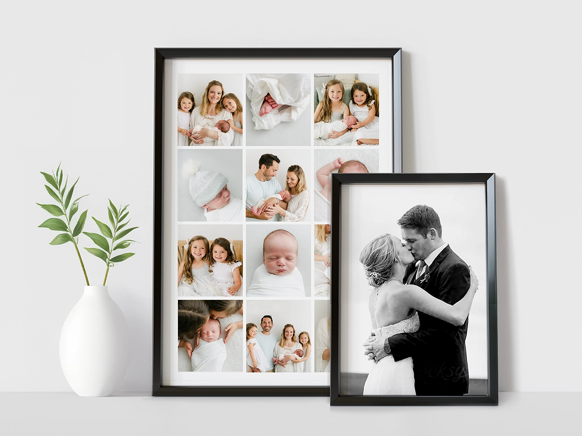
A gallery wall is several photos or pieces of wall art arranged together as one display. Done well, it tells a story that a single picture can't, and it fills an awkward big wall far more warmly.
Done badly, it's twelve holes in the plaster and a lot of regret. So plan it.
The display feels deliberate when the pictures have at least one thing in common:
They don't all have to match. There just needs to be enough of a connection that the eye reads them as a set rather than as a pile.
Grid — same size frames, evenly spaced. Calm, tidy, modern, and the easiest to get right. Brilliant with square prints.
Anchored — one large picture, with smaller ones arranged around it. Gives the eye somewhere to land first.
Organic — mixed sizes and orientations, arranged by feel. Relaxed and personal, but the hardest to balance. Keep the outer edges roughly aligned and it holds together.
Picture ledge — a shelf you lean frames against, overlapping slightly. No commitment, no extra holes, and you can swap photos whenever you like. Ideal if you're indecisive or renting.
Panoramic split — one wide photo divided across several panels. Very effective for landscapes and city skylines.
Lay everything out on the floor first and shuffle it until it works. Then cut paper templates the same size as each frame and tape them to the wall.
Check:
On that last point: the middle of the display should sit at roughly eye level, around 145–150 cm from the floor. Almost everyone hangs pictures too high. If it's going above furniture, leave roughly 15–25 cm between the top of the sofa and the bottom of the frames so they read as connected.
There's no rule, but be consistent. Around 5–8 cm between frames usually works: enough separation to breathe, close enough to feel like one display.
Small frames can sit a little tighter. Large pieces need a bit more room.
Matching frames give you a structured, unified look, and they're the safe choice for a grid.
Mixed frames feel more collected and characterful. To stop it looking accidental, repeat at least one element throughout: the same colour, the same material, the same mount, or the same print finish across every piece.
A single large photo makes an instant focal point and takes about ten minutes to hang.
A collection tells a fuller story and is much easier to add to as your family grows. It's also more forgiving if one photo isn't quite as strong, because it's carried by the group.
There's no wrong answer, but if you're nervous, start with a picture ledge. You can rearrange it endlessly without a single extra hole.
Create framed prints for a gallery wallBoth turn a photo into wall art. They just create quite different moods.
Your photo is printed onto canvas fabric and stretched over a wooden frame. The result has a visible weave and a softer, slightly painterly quality. There's no glass, so almost no reflections, and it arrives ready to hang.
Canvas is great for:
A good canvas comes down to the details: quality canvas material, stable printing, solid stretcher bars, proper tensioning at the corners and hanging hardware that's actually up to the weight.
A framed print keeps the smooth surface and crisp detail of real photographic paper, and the frame and mount give it structure and a finished, deliberate look. What’s more someone else has taken the hassle out of framing the print which saves so much time.
Framed prints suit:
Canvas gives you: no separate frame needed, no glass and almost no glare, light weight for its size, real presence at large sizes, and a texture that flatters artistic images.
A framed print gives you: crisp photographic detail, a choice of frame and mount to match your room, an easy way to coordinate with furniture, a classic gallery look, and a finish that suits portraits and smaller collections.
Choose canvas for relaxed, contemporary wall art with texture and scale, especially somewhere bright where glare from glass would be annoying.
Choose a framed print when sharp detail and a more polished, formal presentation matter, or when you want the frame to tie into the room.
Neither is better. It's about the photo and the wall it's going on.
Metal and acrylic are the two modern, high-impact options. They can make a colourful photo look genuinely spectacular. But they're made very differently and they aren't interchangeable.
A metal print puts your image on a rigid aluminium panel. With dye-sublimation, the image is transferred into a specially coated surface using heat, so it becomes part of the coating rather than sitting on top of it.
That gives you:
Because they shrug off humidity, metal prints are one of the few wall art options that work well in a kitchen or bathroom.
They're at their best with colourful landscapes, architecture, travel shots, cars, sport and anything punchy and high-contrast.
Acrylic products typically present the photo behind a clear acrylic face. Light travels through the acrylic before it reaches the image, which creates a glossy, glassy surface with a real sense of depth, almost as though you're looking into the picture.
Acrylic suits:
| Metal print | Acrylic print | |
|---|---|---|
| Look | Sleek, sharp, direct | Glossy, deep, glass-like |
| Weight | Usually lighter | Often heavier |
| Surface | Coated rigid aluminium | Clear acrylic face |
| Reflections | Depends on the finish | Usually more reflective |
| Durability | Very robust and practical | Strong, but the face scratches more easily |
| Style | Modern and minimal | Premium and dramatic |
| Typical cost | Often lower | Often higher |
Canvas is softer, textured and more traditional. Metal is sharper, glossier and unmistakably modern.
Pick canvas when you want warmth and an organic feel. Pick metal when you want bold colour, crisp edges and a contemporary finish that stands up to a busy household.
Look for:
Soft, muted or deliberately low-contrast photos, and gentle portraits, usually look better on fine art paper or canvas. Metal amplifies whatever is already there, which is fantastic for a sunset and less flattering for a hazy indoor snap.
Create a ChromaLuxe metal photo printFirst, the pronunciation, because nobody wants to get it wrong at a dinner party: zhee-clay. It comes from a French word meaning to spray or squirt, which describes how the ink is applied.
A Giclée print is a high-quality inkjet print made with specialist pigment inks on coated fine art paper. Millions of tiny, precisely placed ink droplets build the image.
Hahnemühle defines Giclée as reproducing artwork, photography or digital work with an inkjet printer, usually onto coated archival artist paper using pigment inks. Pigment is the key word: pigment inks are far more stable over time than the dye inks in a typical home printer.
Both can be superb. They're just different processes with different personalities.
A silver halide photo print is made on light-sensitive photographic paper. Smooth surface, classic photographic look, ideal for everyday photos, portraits, albums and framing.
A Giclée fine art print is made with pigment inks on specialist inkjet paper. The paper is usually heavier, often matt, sometimes visibly textured. It suits artwork, illustration, exhibition photography and any image where the character of the paper is part of the appeal.
If you want a photo to look like a photograph, choose photographic paper. If you want it to look like a piece of art, choose Giclée.
No, and this is worth knowing before you spend money.
"Giclée" isn't a protected or regulated term. Anyone can use it. A print from a home inkjet on ordinary paper can be described as Giclée without breaking any rules, and it will be nothing like a proper fine art print.
Before ordering, look for clear information about:
If a seller can't or won't tell you, that tells you something.
Smooth papers hold fine detail best and suit photography, graphic work and detailed illustration.
Textured papers add depth and tactility, and are lovely for paintings, drawings and anything you want to feel handmade.
Bright white papers give crisp whites and punchy colour. Natural white papers are warmer and softer, and often flatter skin tones and older photographs.
Choose the paper that serves the image. The most textured or most expensive option isn't automatically the right one.
There's no single number, and be wary of anyone who gives you one.
Longevity depends on the exact ink and paper combination, how much light the print gets, humidity, temperature, how it's framed and how it's stored. Some professional pigment ink and paper pairings achieve very high permanence ratings in laboratory testing, but those figures apply to that specific combination under those specific conditions. They aren't a blanket promise for anything labelled Giclée.
To get the longest life out of yours:
Nobody asks this until they find a box of faded 1990s prints in the loft. So, briefly:
Modern photographic prints are made to last decades in normal display conditions, and considerably longer stored properly in the dark. Fujifilm's Crystal Archive papers are designed specifically for colour stability over time, which is a large part of why professional labs use them.
What actually ages a print isn't time. It's light, heat, damp and handling.
And the most reliable archive of all: print more than one copy of your absolute favourites and give one to someone else. A photo that exists in three houses is far safer than one on a phone that goes in a puddle.
Almost always. A modern smartphone original will make excellent standard prints and plenty of large ones too. Sharp focus, decent light and not cropping too hard matter just as much as megapixels.
Your photo and the print size are different shapes. It's either cropped to fill the paper or fitted inside it with white borders. Drag the crop frame in the preview to choose what stays.
Yes. Upload straight from your desktop, or from Google Photos, Google Drive, Dropbox or Facebook if that's where your photos live. Uploading from a computer is often easier when you're ordering a big batch after a holiday.
Only with their permission. Wedding, newborn and school photographers own the copyright in their images unless they've agreed otherwise. Many now supply digital files with a print release, which is exactly what you need. If you're not sure, ask them, most are happy to confirm in an email.
JPEG is the workhorse and works everywhere. PNG and HEIC (the format newer iPhones use by default) are also fine, and get converted for printing. If you shoot RAW, export a high-quality JPEG in sRGB before uploading.
A high-quality JPEG in the sRGB colour space. Use the original file, and try not to save it repeatedly, as each save can shed a little quality.
Because your phone glows and paper doesn't. A screen at full brightness makes shadows look far more visible than they'll ever be on a reflective surface. If a photo is dark on screen, brighten it a little before ordering.
Screens vary enormously, and most aren't colour-calibrated. Phones in particular boost saturation and contrast to look punchy. A good lab prints to a controlled, consistent standard, so your print reflects the actual file rather than one particular screen's interpretation of it.
Matt (lustre) usually. Fewer reflections behind glass, fewer fingerprints, and it doesn't have gloss's tendency to stick to the inside of the glass over time.
6×4 inches, still, by a mile. It's the everyday album and memory box size.
A4 for a small wall or as part of a group, A3 for real presence, A2 and A1 for statement pieces. Measure the space and tape up a paper template before ordering. Nearly everyone wishes they'd gone one size bigger.
Slight softness can sometimes be improved. Genuine missed focus or motion blur can't be properly fixed, because the detail was never recorded. If a photo is soft, print it smaller. A lovely 7×5 beats a disappointing 16×12.
No. File size tells you nothing about sharpness. A large file can be blurry, noisy or heavily compressed, while a smaller, well-focused original prints beautifully.
Light-touch edits help: straighten, crop, nudge the brightness, warm it up slightly. Avoid heavy filters, aggressive sharpening and endless re-saving. Always keep the original untouched.
Yes. Photograph or scan them first. If you're photographing them, lay them flat near a window (not in direct sun), turn the flash off, hold the phone parallel to the print and fill the frame. Scanning at a high resolution gives a better result if you have access to a scanner.
Yes. Borders are a good way to keep the whole photo when the shapes don't match, and they look smart in a frame. It's an option at the point of ordering.
A photo print is made on genuine photographic paper using a silver halide process. A poster is printed with inks onto poster paper, which is how we produce the very large formats. Photo prints have that classic photographic look, posters give you scale.
More than you think, and fewer than you have. A good rule after a holiday: print the ten you'd actually want to look at again in five years, rather than the hundred you took.
The best print isn't the biggest, the shiniest or the most expensive. It's the right combination of photo, size, paper and presentation for the memory and for the place it's going to live.
At PostSnap we do premium UK photo printing and wall art, and not a lot else. Every order is checked by an experienced print technician, and if we spot something we can't safely put right, we'll contact you before we print rather than after.
Choose from more than 50 photo print sizes: traditional photographic prints, framed prints, canvas, personalised posters, metal prints, photo tiles and Giclée fine art prints. All made to get your favourite photographs out of your phone and onto your walls.
Start printing your photos